


Goal: to assess the on boarding experience of potential users for the Alcye site
Timeframe: three weeks
Team: three UX designers
Roles Throughout The Project: Note taking, conducting interviews, transcribing, pulling quotes, affinitizing, copywriting, developing insights, creating style guide, sketching, wire framing, prototyping
Key findings:
Users are not sure about the site’s purpose
Users want a demo that they understand and don’t need to contact the site about
Graphics are confusing and thematically different
Text is confusing and too high level

Left: the original site; Right: UX based revision of the site
The Front of House Project
This is client work that I did in a group at General Assembly with two other UX Designers. We met with the owner and developer to discuss their needs. We were tasked with “front of house”, meaning we would look at what needed correcting for everything before you log in. In essence, we needed to know what people thought when they came to the site and make sure that they were understanding everything that is possible once they are users. We made suggestions to improve this.
On the left is the actual website and the one on the right is the redesign that I completed in Sketch and Invision. If the redesign was successful, on boarding new clients would be more effective and new visitors would have a clear understanding of what Alcye does and how it does it.
Preparing for the Project
After an initial meeting with the client and developer, we knew that we needed to user test the site to see what the pain points were. Through talking to the client we developed a persona of the key users. We began talking to users about the existing site.

Graphics from the original site, users showed confusion on content and style
Evaluating the Site
We started with a Heuristic Evaluation and SUS. Users stated:
hero image is confusing and does not convey the spirit of the site
graphics were called inconsistent and confusing
text is hard for our users to understand, and dense so they don’t read it
users did not know what it was that they should be doing on the site, how they would do it, and what it took to get started
We needed to use a hero image of individuals learning together. Developing a style guide so that both teams could use the same icons, fonts, colors, and sizing to create a uniform look throughout was also important. Simplified language and more obvious imagery would clarify what the user would be doing and how.
To determine the best choices for these changes we needed user insights into their what would be effective. We interviewed users about their experience with group education. This clarified how to best position this to users.
clarifying the insights
The first interviews used pink post it notes and the second interviews used orange. This differentiates the interviews visually and topically.
The experience ranged from people that were in a class, people that had not taken classes for twenty years, to retired educators. These interviews could now highlight the importance of education factors, how that relates to Alcye, and how to best explain it.
Affinity Mapping
When looking at the different categories, we developed some insights. From these insights, we knew to focus on:
Alcye’s ability to search for someone that has a specific skill or knowledge within the group
how there are multiple ways for a user to communicate with Alcye
how much this platform fosters engagement for all of the learners
what happens when you submit your information, how you get a demo, or even a different way of demonstrating the platform to users.

Affinitizing the user quotes from two rounds of questions: pink - user feedback on alcye site, orange - experiences with group education
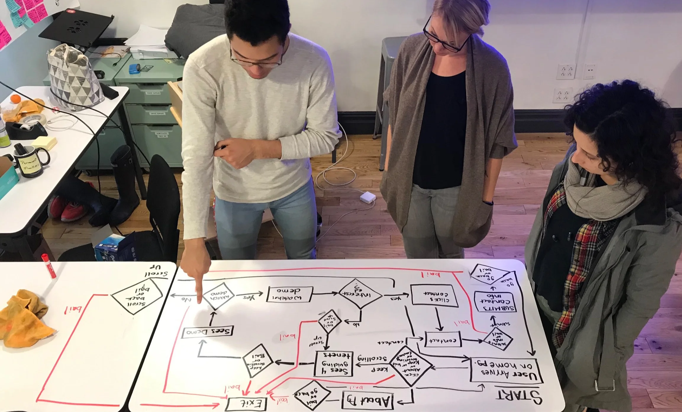
Creating a user flow to map out what the revised site should include and how
User Flow
Users wanted to see what Alcye can do without having to request a log in or a demo. To show the functions of Alcye, we decided to place a video at the bottom of the page that would show the user since most people are visual but did not understand the still images from the original site.
For progressive disclosure, we give a simple explanation of what Alcye is, then we show the core values with pop ups that explain how Alcye accomplishes those things:
community, mentorship, social learning, and peer engagement
Continuing this, we have other pages that go into further detail about Alcye’s origin and beliefs.
To help users with questions about cost and how they can reach out we followed some industry standards.
relocating to their own pages
explicit explanation of what would happen with any user information that was submitted
stating when they should expect a response
Finally, users are more likely to contact a company through social media that they already have a log in for. This option was added to the contact page.
Copywriting
User testing showed that people did not understand the language. Tools such as the Hemingway App agreed that the language was too difficult to understand. We took our passionate owner’s high level thinking and simplified it for an average user. I took the sections of text and either simplified or completely rewrote them. If rewritten, I wanted the same spirit of information, but casual. Team members looked at my copy and made notes or edits. We then distilled this into the best versions possible. In the image, most of the edits were already made and there are only a handful of items left to adjust. This gives us something to put in front of users. Now we can see how they feel about the new copy and make adjustments as necessary.

Taking the original copy and coming up with two versions for user testing after team editing

Creating a style guide for a unified look to the site
Style Tile Questions
We wanted more insight to the desired look and feel of the site, so we used Style Tile Questions. From these questions, we worked with the team that was doing “back of house” operations to make a style guide.
Some of the key take aways from the questions and speaking with the owner are:
professional, but very fun
soft edges and soft colors
something you’d want to keep coming back to
Style Guide
Based on the style tile responses, I came up with some initial options for the style guide. Pairing with the other team, we worked to combine ideas. The header font is playful, yet professional. It is softer and inviting. The secondary header font is serious and easy to read. The body font is very easy to read and consistent with the second header. The colors reflect the Alcye logo (the red), the Mediterranean vacation feel (the blue), and some accent colors that fit with those.
Style Guide Mock Up for Client
To clarify what the styles are, I made a mockup of their current site with the style guide added, and no other changes. I don't want it to be confusing about what they do or do not like. By doing this, they were able to understand the direction that we were going and give approval. I first showed them the style guide and then this mock up. They liked the wireframe, so we were free to move forward, confident in our product.
These particular icons were not functional for the project, so we communicated with the other team to develop and locate others.
You may have noticed that Alcye has was not capitalized in the logo. This became a part of the style guide. Many lines that you would capitalize remain lower case. This gives a subtle touch and a thematic feel. It is not displayed in this style guide mock up, but is show in the final wire frames.

Creating a mock up of the original site with the style guide to understand the new appearance

Creating wire frames to user test what features and appearance they prefer and why
Mid Fidelity Wireframes
We put some of our ideas into a form that we could put in front of users. We can now get feedback about what they do and don’t like about the changes we are making and also what they are expecting. We can ask “based on this text, what image are you expecting to see here?” and other questions to help guide what we create. Also, we can get feedback if their interpretation of the text is what we intended or if we need to rewrite it. These are some initial ideas. We ideated the different ways that they could be expressed, and went over industry standards for placements.
The first wireframe is a single page version of the site, and the second and third wireframes are more of a progressive disclosure version. We tested these with users.
Updated Mid Fidelity Wireframes
The users wanted the progressive disclosure of the second and third slides, but they also wanted more of an about section and a demo on the screen. The middle wireframe shown to the right is the compilation of these things being moved onto one screen. The other additional information for the key attributes are still on the third slide and would be pop ups.
Users agreed that an image of people learning together was expected for the hero image, and icons of the different attributes made sense in the “how Alcye does that” section.
People were comfortable with the additional about, contact, and log in screens.

Moving items around on the wireframes based on user feedback, incorporating different aspects

High fidelity wireframes of the redesign (clickable prototype available to the right)
High Fidelity Wireframes / Prototype
Feedback from users, team members, and best practices shaped the product. I made high fidelity wire frames in Sketch and the interactive prototype in InVision.
Learner Outcomes
There is more copy to write, and more owner feedback about how they would want to demo the site and cost to users. This feedback was requested but not obtained during the project. Overall, I’m pretty satisfied with my roles and my performance on this project.
The main thing that I would change is the timeline. We finished the wireframes so late in the process that we didn’t have time to user test. That also means we didn't get SUS scores to compare to the original. Also, the team members chose their own assignments as things that they wanted to work on and get stronger at. We should have worked on items we were already confident with to work more efficiently. Team members were not completing tasks and not reading the written posts in Slack to understand key information that we needed. I’m not sure what the new process would be for people to complete their assignments. A Trello board where an assignment is marked “complete” after completion would help. Another team member could then verify that there is satisfactory work. Things along these lines are important for accountability during a project.
The Home Depot

USAA

American Express

Coffee Crew

Planiteers

Alcye