Goal: To create a coffee app for “the coffee enthusiast” that solves some current pain point
Timeframe: four days
Team: five UX designers for research, one UX designer for app development
Roles Throughout The Project: note taking, user interviews, affinitizing, ideation, sketching, wire framing, prototyping, creating a presentation, and discussing the presentation
Key Findings:
coffee is utilitarian for energy or communal for socializing
when individuals are busy they don’t make time for socializing over coffee
locating new coffee shops was based on referral
Observation
We worked on teams to do research and some analysis, but ideation and beyond was done individually. We needed to identify a coffee drinker's pain points and then create a solution for one of them. It was interesting how very different conclusions came from the exact same data.
In a coffee shop, we observed individuals, the space, the flow of the customers coming in, making orders, and other actions. We looked at baristas, their interactions, and what happened throughout their job.
Some of our observations were that:
people either grabbed their coffee and left, or stayed a very long time
that there were peaks and valleys of the line not related to the time of day
some of the people were in groups, but most of the people were individuals
We formed interview questions to find out why people went to the coffee shop, why they stayed, what their habits were, what they liked about this particular coffee shop (and coffee shops in general), and if there was some particular issue that could be solved.
User Interviews
Some themes seemed to emerge:
people either got coffee because they needed energy to get work done, or as an activity to relax
people that stayed were either trying to work or were there to relax
there was a social component to which shops people chose
more likely to socialize with coffee when their schedules were more open
individuals missed the social aspect of coffee meet ups when they were busy
One example was a college student that spent her summer trying to find the best vanilla latte in town, but hadn’t really been to coffee shops often once school started up again. Another example was an out of town worker who liked to meet up with her friends to try different coffee shops as much as possible, but when her work assignments became hectic these meetings became less frequent.
User interviews at a local coffee shop to gain insights into their habits and pain points
Graphing HMW statements to clarify potential ideas to focus on
User Statements, How Might We, and Charting
Graphing HMW statements for “Simple and High Impact” to determine ideas that are easiest for the user to understand and yet more impactful on their experience. Out of these ideas, the main ideas that came out were:
increase coffee consumption
ease of use for getting coffee
get people together for coffee
increase coffee shop visitation
Research showed an important and appealing problem was getting people together for coffee. Social media can be used to get people together, and specifically for coffee. Apps such as Five Star can give discounts but not invitations. Through some ideation, I came up with a novelty.
An App is Born
My MVP became getting people together for coffee resulting in a discount for everyone involved. I started with rough paper prototypes. The original features were:
setting up groups
posting to social media
getting everyone together
After talking to users, I added:
looking at maps for coffee shops
seeing all of the discounts
looking at your favorite coffee shops
seeing what is trending from other users
I created new versions of the screens and put them in front of potential users. Some changes to the social media were made so that if someone wanted to post or not could be individualized. The icons weren’t always clear and a few iterations were needed to clarify what would work. The “dinner triangle” was changed to a bell, and back to a triangle. For this project I didn’t work in low fidelity wireframes to get ideas in front of users faster, combining potential icons and copy.
Edits to the MVP based on feedback were:
trending is not necessary (it could be a sorting option for coffee shops)
favorites were not necessary as a screen, but could be part of the sorting
home screen was simplified
Other features were removed for “next steps” on later updates.
The original idea of the discount was that you would have people say that they would join (by accepting the invite) or declining. Then, each person would check in at the coffee shop. There would be some window of time that each person would have to check in to still get group credit. From user testing, this seemed impractical and a logistical nightmare. I would have to think about a way to make this more convenient and less steps for the user.
Initial paper wireframes with post it note iterations added
Testing the Paper Prototype
These are individual screens that allow a user to “click” on something and see the results of that action. People seemed to like the idea of the app and it seemed fairly intuitive from user testing.
Some of the highlights of this version were:
The ability to chat to an individual or a group
The ability to get discounts based on the group
The ability to check in to the location to receive the points
Coffee Crew logo for use in the app
going digital
This was a good first run through, but it still needed some clarification. Reworking the concept to focus on the MVP and streamline the process was the next step. I created some digital wireframes and an interactive prototype in Principle.
The app didn’t need four different options on the bottom navigation. I simplified this down to two important screens of communication and the coffee shop locations (and discounts on the home screen.)
I created a logo to focus the appearance. I wanted something simple and easy to explain what the app does. User interactions indicated that the logo itself explained a majority of the app's purpose.
Reworking the Wireframes
By removing some of the features, the app is easier to use and anyone can figure it out. A revision of what the app could look like in a mid fidelity wireframe was drawn with user flow indications.
bottom menu has two icons
settings option is only on the home screen (for setting up an account)
discounts are part of the home screen and can be accessed from the chat screens
favorites are a part of the listings themselves
The core feature of the app is that by getting together with your friends you can get discounts. This is different than just a chat app or a discount app. It combines these things. What is not necessary is any check in feature. This could be a back end solution that does not need to be displayed. For example, when the phones are near each other at the location it is logged in the app. Points can be added to each group member’s account. When additional friends check in, each user’s points can be updated. The users can then redeem the points at that location for rewards.
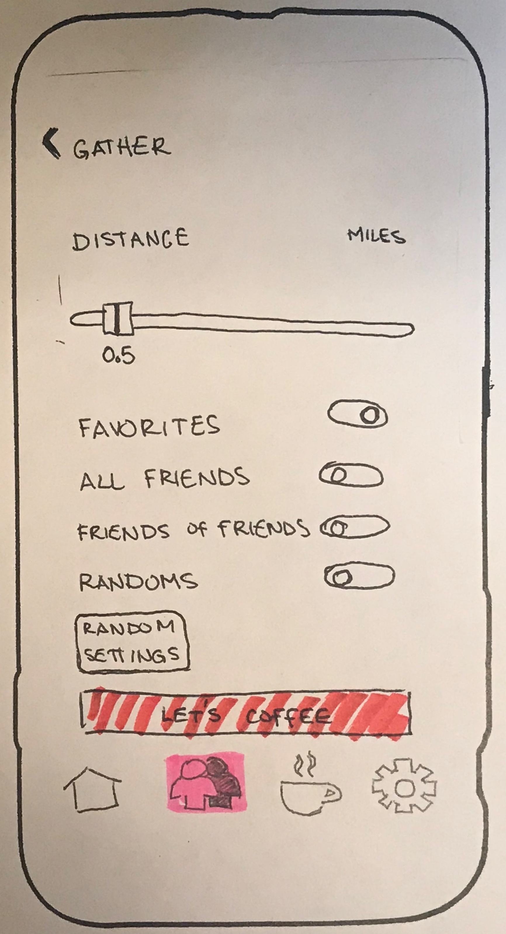
Hand sketching some wireframes with user flow indications before using Principle to create a prototype
One iteration of the prototype in Principle before going to a flat design
High Fidelity Wireframes / Prototype
Here is an example of what this app might look like. I wanted the casual and social nature of a coffee house that they might want to visit.
Using Principle to make the wireframes allowed me to do some animations that I can’t do in Sketch.
The photo of the app isn’t a finished version. I added things like shadows into the screens for more depth. Comparing this to current design philosophy, a flat design is actually more contemporary. So in the prototype video below, you will see that the shadows have been removed, and the features have been flattened as much as possible.
Learner Outcomes
Looking back at this project, the main things that I would change were research related. More open ended questions with more focus on all of the consumption of coffee might produce better information. Also, for this project we didn’t pull exact quotes from the interviews. I would work in lower fidelity longer, to separate a user’s feedback on the different items and to clarify what is and is not working. I would also start simpler, meaning just the MVP and as people are asking for the different features, make notes of them and decide what is necessary for it to function and what is better for a later version. This was actually the first UX project for me, so there was so much that I’ve learned since then. I did enjoy the thought process and coming up with a novel solution for an everyday situation. If it was expanded to food and even drinks then I could see it being a very helpful app. Now that I have completed the high fidelity prototype I am very pleased with the project.


