Goal: To complete a Hackathon by solving a problem with a team during one class day
Timeframe: 5 hours of group time to complete the work
Team: four UX Designers, one Developer
Roles Throughout The Project: facilitator, ideation, user flow, sketching, wire framing
The final deliverable from the hackathon: the planiteers website
Overview of Planiteers
This is a collaboration between three UX designers, myself, and a developer. Our final idea was to have a volunteer website for a corporate tree farm. Businesses would supply trees and the land. Volunteers would plant the trees and take care of them. These are fruit trees so that the food could be donated to a local food pantry or sold at a farmer’s market. This brings awareness to the cause and funds back to the project. Volunteers pick the fruit, transport supplies, or other needs for the tree farm to succeed.
The name came from planet Earth and a play on the children’s show "Captain Planet and the Planeteers". Since this is a tool for planning volunteers we are Planning It, or Planiteers.
Iterative Process
Normally, I follow the iterative process. For this project, things were a little different. We didn’t have a given problem, persona, existing company, product etc. This meant determining for ourselves what problem to solve and how.
The instructions were to “find something that is a problem in the world and solve it.” This is very vague. We modified our normal approach to tailor it to this situation.
Analysis & Synthesis
Instead of analyzing something that already exists, we were analyzing the world. We needed a context to start solving a problem. We could start talking about problems that already exist and choose one of them. Instead, we started talking about our user that we wanted to solve a problem for. In doing this, we could identify them and focus on what they would want a solution for. We started with descriptors of our ideal person and created a proto persona.
Without a clear starting point, the iterative process has to be adapted to constraints
Group collaboration on a proto persona to determine a problem that can be solved
Proto Persona
We talked about our target user, their interests, and what details would be important. This was a free flow discussion with people listing off qualities and others building on what was already said.
Our proto persona became a millennial, active with environmental and animal issues. After that, we came up with related problems and their solutions.
Ideation
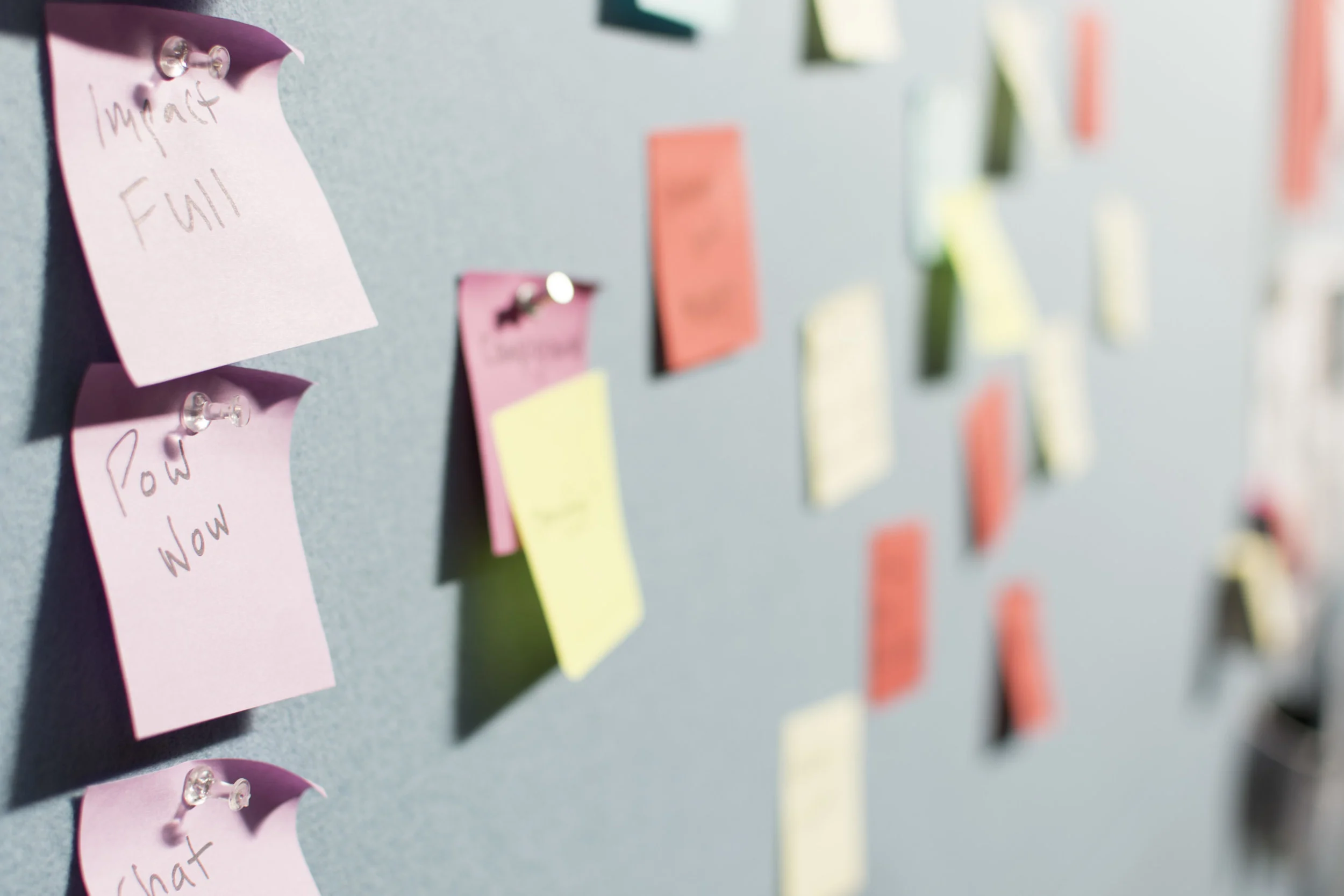
Due to the fast turnaround, we didn’t have time to do some of the lengthier processes. Instead, we did five-minute sessions of writing ideas about a solution for our persona to get lots of ideas out quickly without the constraints of coming up with something amazing. We just wanted varied ideas. We then presented them to the group to explain our thoughts. Building on this, we did a second round. In this round, either new ideas were created or discussed ideas evolved. After we wrote our new ideas on sticky notes and explained them to the group, we placed both sets of sticky notes on our table did a silent dot voting.
Presenting ideas, building on those ideas, and voting on them
Charting the most interesting ideas to find a high impact and uncommon idea
Charting the Ideas
Ideas that got at least one vote went onto a chart. We talked about where they belonged from low to high impact and from common to uncommon. We wanted something uncommon and high impact. This would be a novel idea that would make a large change in the user’s life.
If we had conflict we would default to our developer who focused on what they could complete in our time allotment. Christine, our developer, gave feedback on what each idea would take to build and if it could be done in the time frame that we had.
Idea Finalists
After silent dot voting and charting, we had three ideas that were uncommon and high impact for our users. A corporate tree farm, pollution reduction site, and pet-centric mapping tool.
Ultimately, our developer told us what they could complete, and guided us towards our final idea of the corporate tree farm.
The three final ideas: corporate tree farm, pollution reduction web site, and a pet friendly mapping tool
Creating a user flow to determine what screens were needed and how to get there
User Flow
This is the basic idea of what our website should look like and what pages to create.
Originally this was a mobile app, so the first screen would need to be a log in (which could be saved so that the user doesn’t have to log in each time.) After they logged in, we needed to look at their main functions. The user would need to be able to select the tasks that would complete, look at their points, use their points, check in at the volunteer location, sign a waiver (one time only), and also to request an even for the app. Each of the volunteer actions would have a similar path so that it was easier to create the prototype. This process was a direct path towards what we wanted to accomplish.
We adhered to industry standards such as originally putting section icons at the bottom of the app, breadcrumbs at the top of the pages to allow faster navigation, and progressive disclosure of features and data required from the user.
Initial Wireframes
We created wireframes, and used these to do usability testing with users.
People wanted to be free to choose options in a different order. Instead of picking a task first, they wanted to choose a location, or a time. We adjusted our user flow for this.
After user testing we had discussions with our developer. We would be removing the points viewing and redemption at this time as well as the check in screens. The points would just be stored with the user’s account. We didn’t add a feature for the points to be viewed, but this could be added to the top of the screens as an updated total. This would be more functional for the user and less feature fatigue.
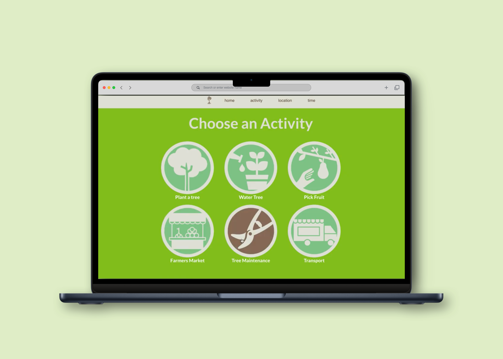
The important screens were now the log in, choose an activity, choose a location, choose a date / time, and approve the activity. These screens are hand drawn and used to start on the wireframes below.
The user testing produced positive results for ease of use, understanding what the app was used for, and familiarity with the processes. From the mobile app, this became a desktop website, as a responsive web site could work on any device.
Creating screens for user testing
High fidelity wireframes used as a template for the developer
High Fidelity Wireframes
These final wireframes are based on the style guide and user flow. We decided to use green and brown as it is an earth related app. We added screen headers at the top of the site to allow a user to choose where they would like to navigate. After someone is logged in, the two main choices were by activity or date / time to allow for flexibility, based on our user’s feedback.
We created simple screens for our pages to make it easier for the user to decide what to do next. These are the screens that I made in Sketch that our developer used as a reference while programming the site. The logos, color hex codes, and specific fonts were given to the developer. We also found related imagery to go along with the activities instead of text only descriptions.
Final Product
Our developer created this video to show the finished product. They have a programmed version of this that can not be hosted online. This would be the first version, with the features that we removed added later.
Next Steps
If this were to be fully developed, there are a lot of things that we would want to incorporate. There is currently no real back end to save the user profiles, points, and other data. We would want to involve businesses to fund the points and redeemed them for items. They would also donate supplies and other necessities to keep the project moving. We would also want to involve the city to donate land for use.
For the app itself, we would want to include some type of notification about current point totals. We can also reconsider the other features and if they are necessary for the MVP.
If I were to start this all over again, I might start with something such as “what was a problem that you had this past week?” to start our brainstorming session. This would allow for more of the iterative process to be completed. I believe we still completed most of the double diamond approach to solving a problem, but this would have given a much wider scope of problem options to start with.
For such a short period, there really weren’t any major obstacles. Our developer made all the hard decisions based on our resources. The main resource was time, and there is only so much that one developer can accomplish in a night. I thoroughly enjoyed this project and the results.


